Advantages of Completing a Profile Building Course
Request A Call Back!
Data Visualization
A 40-hr Live Online Program that covers Excel, Microsoft Power BI, Tableau, and Data Story-telling. It is recommended for all MBA aspirants.
Fees : Rs. 30,000/- (all-inclusive) for Live Online Program.
Rs. 24,000/- (all-inclusive) for IMS students — a 20% waiver for all IMS students
Why Data Visualization?
Data Visualization teaches you how to tell a compelling story with your data. As we scramble with immense data in the current world, Data Visualization is a skill that is a must to be learned to become effective communicators. This is a skill that you can learn irrespective of your educational background. And, if you are an MBA aspirant it can help you to interpret data through pictorial representation, and hence it is a very useful tool to learn in order to excel in your chosen field.
IMS Proschool offers a comprehensive data visualization program that equips you with not only the knowledge of visualization tools but also grooms you to tell compelling stories with your data. IMS Proschool Data Science Program is ranked 4th by AIM and has consistently been among the top 10 institutes in India across products and services.
Program Features
This program will equip you with all the three popular tools that are in use today — Excel, Power BI, and Tableau. The program is packed with industry-oriented case studies, which will make you, job-ready
- 40 hrs – Live online sessions by industry experts
- Data Story Telling Module – with MICA Adj Dean
- Covers all tools – Excel, PowerBI and Tableau
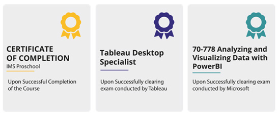
- Prepares you for Tableau and PowerBI certifications
Certifications


Syllabus
Excel
- Data , Data type , storage of data.
- Basics: Create, close, Tabs, Groups, Editing, Formatting.
- Cell: Characteristic , Cell Reference, Text to columns.
- Filling: Copy and Fill, Advance Fill, Fill series, Flash Fill
- Data Sorting, Filters, Tables
- Visualization, Histogram, Graphs, Pie charts, Scatter plot , Bar, Line, Area etc.
- Pivot table, Shortcuts
Story Telling
- Defining the Audience
- Understanding the Data
- Deciding the objective
- Types of communication
- A project on story telling
Power BI
- Connect to data sources.
- Perform transformations.
- Cleanse data.
- Create and optimize data models.
- Create calculated columns, calculated tables, and measures.
- Measure performance by using KPIs, gauges and cards.
- Create hierarchies.
- Create and format interactive visualizations.
- Manage custom reporting solutions.
- Access on-premises data.
- Configure a dashboard.
- Publish and embed reports.
Tableau
- Introduction to Visualization
- Tableau Architecture
- Tableau Prep working
- Tableau Online
- Tableau Server Architecture
- Files in Tableau
- Tableau Workflow
- Connecting to Data, Data Types in Tableau
- Graphs, Tooltips
- Hierarchies & Data Granularity
- Sorting, Grouping, Sets, Filters
- Parameters, Calculations
- Tableau Dashboards
- Adding Actions in a Dashboard
- Tableau Stories
- Tableau Story workspace
- Creating a Tableau Story
Modern Day Visualization

| Course | Fast Track/Weekend | Batch Date | Time | Days |
| Data Visualization | Weekend | 18-Apr-21 | 2 PM to 6 PM | Sun |
- IMS students enrolled in any Program (CAT, CET/CMAT, GMAT, GRE, BBA, Law) and in all Learning modes (classroom, correspondence, test series, Live, & Self-Learning Programs) are eligible for a 20% loyalty waiver.
- All students enrolled from 2017 onwards are eligible for the loyalty scholarship.
- Students enrolled for programs at zero fees (SimCAT solo and other free variants) are not eligible for the loyalty waiver.
Testimonal

Analytics is trending and IMS Proschool has the most detailed syllabus and a defined course structure. Concepts were explained from the basic level progressing to advanced levels. All the aspects of a concept were covered in detail. Their entire team is student friendly and supportive.
Navneet Singh Teotia

The guidance of the faculty helped me in getting an opportunity to manage & develop new project for supply chain division. Thanks to IMS Proschool for the support. Never thought Analytics could have so much positive impact on my profile.